
Common sense is a powerful tool we use every day to help us make decisions, and while it is extremely useful, it can also lead us astray. Jordan Ellenberg’s book “How Not To Be Wrong” explains how the skills honed through the study of mathematics can help us to overcome these shortcomings and extend the reach of our common sense.
In a previous article I looked at survivorship bias and other ways in which the human brain has developed in a way that can lead to incorrect assumptions being made. “How Not To Be Wrong” expands this list and looks into a range of other instances where commonly used lines of reasoning expose some slightly alarming assumptions and oversimplifications that people instinctively make on a regular basis.

I’m going to look at one of these cases and how you can identify when you might be making this mistake.
Not Everything is Linear
A straight line on a graph is a very attractively simple thing. It was probably the first type of line graph you ever looked at in school.
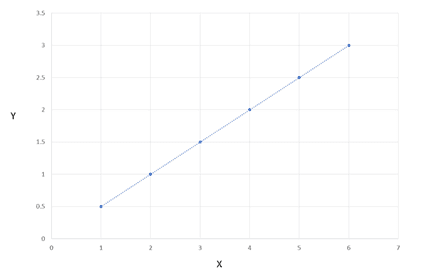
It’s easy to understand what it means too. As X increases, Y also increases (or decreases, if the line points down) in a nice predictable way.
Real life is rarely this neat though. Often the data will form an S or some other shape (or no shape at all). In a lot of cases though, a linear model is a useful way to approximate how small changes might shape particular outcomes. We use these sorts of techniques in research a lot as a quick way to approximate the relationship between different measures.
Our brains know this too. This is why in most cases, the instinctive first assumptions our brain forms when trying to understand how A might affect B is to assume linearity.
“If some is good, then surely more is better”.
In some cases however, a linear relationship (with both measures increasing in step) is not appropriate.
It’s perhaps an obvious statement, but just because raising the price might result in increased profits, doesn’t mean that we should expect raising it further to have the same result. This is an obvious example, but where you can trip up in business decisions is when the situation is less obvious.
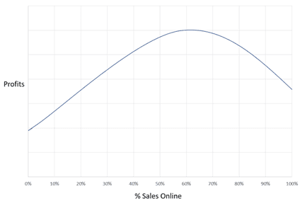
Imagine that you have seen a jump in profits at the end of a year, and following some research you conclude that the jump was a result of the successful roll-out of your new online portal. Online sales went from about 40% of your business to about 60%, and profits jumped in response. You decide to aim for a similar increase the next year, getting online sales up to 80%, in the expectation that this will result in a similar jump in profits.
Come the next year you find that profits are down despite hitting your target for online sales. What went wrong? Could you have seen this coming?
Escaping the Trap
A useful trick to check if you are going to run into trouble is to consider the extreme cases.
What would happen if it was 0%? In that case, costs would be much higher and businesses looking for the speed and convenience of online sales would go elsewhere, so profits would go down.
What would you expect to happen if you made 100% of your sales online? If you currently have 40% of sales through offline channels despite the portal being available, it is likely that at least some of your customers prefer other channels. If you remove these other options, then these customers might leave you, resulting in a loss in sales that more than offsets the costs saved when sales are made online.
Once you realise this, you can escape the trap.
Now you know you are not looking at a straight-line graph, two questions need to be answered:
- What does the curve actually look like?
- Where are you on the curve?
In the example we looked at, the curve might have looked a bit like this:
As long as you are somewhere in the green area, then things will go as expected:
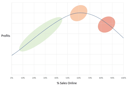
The trouble comes when you think you are in the green patch, when the truth is that you are in the orange, or even the red. This can even lead you to do exactly the opposite of what you should be doing!
What Now?
When planning business objectives or trying to predict how changes might affect the future of your business, always be careful to check you aren’t falling into the trap of assuming a linear relationship. What would you expect in the extreme cases?
Some market research models can help with this problem. The Kano model for example sorts product and service components based on how we would expect delivery to impact appeal, Conjoint analysis can identify at which level of performance we see diminishing returns on improvement and linear regression can help pick out what relationships it is safe to treat as linear.